
YOUR CLOSET REDESIGN
Re-imagining the way you organize your closet
Background
Your Closet App is a closet organizer and style planner. It allows you to add clothes to your virtual closet by taking pictures or importing from your gallery. You can mix and match different clothes; resize, rotate and arrange different outfits to plan what you want to wear everyday.
ROLE
Designer and Researcher
DURATION
2 months
SKILLS
Sketch
Invision
Adobe Creative Suite
Usability testing
Competitive Analysis
Information Architecture
Journey Mapping
User Interviews
Process

Current experience
I downloaded the app “Your Closet-Smart Fashion” for an upcoming vacation and thought it might be a fun solution to my recurring packing problem: “What do I have to wear in my closet?!” While this app is currently the top rated closet organizer app for its genre, I thought it could use some improvements.
As I read through the app’s description I appreciated how many features the app had to offer. From organizing, creating and planning, it was extremely helpful in breaking down each function into categories.
However, when I downloaded it I felt overwhelmed in terms of where to start and where certain features were located. I thought to myself, "Am I the only one who feels this way?"

Process of selecting a new outfit
User Research
To learn more, I conducted contextual interviews. I approached test subjects with different scenarios. From packing for a vacation to prepping your daily outfit, I watched as friends and strangers navigated through the App and noted the most popular complaints. I concluded the study by uncovering four main user pain points.


Interviewed 15 people
ages (18-35)
Task: Try to create an outfit
Synthesize findings and identify pain points
Insights
The consistent feedback I received from a majority of the participants found it tedious to go through the app as well as found it interesting that the app lacked certain functionality. Below are the four main user pain points that I discovered through my research:


Ideation
Having a few ideas in mind, I had to narrow down the type of approach that could solve these current problems.
While my usual design tactic is to download competing apps to see how they approach similar problems,I decided to download other types of fashion apps to try and get a more unique perspective on the problems I was facing.
To create a unique and effective design, I decided to combine Urban Outfitters clean and easy navigation with Forever 21's condensed categories while thinking of the design flow for Your Closet.
Login
Homepage
Profile reveal

Select screen
Share selection
List of options
Add item
Edit mode
Select category for item
Information Architecture
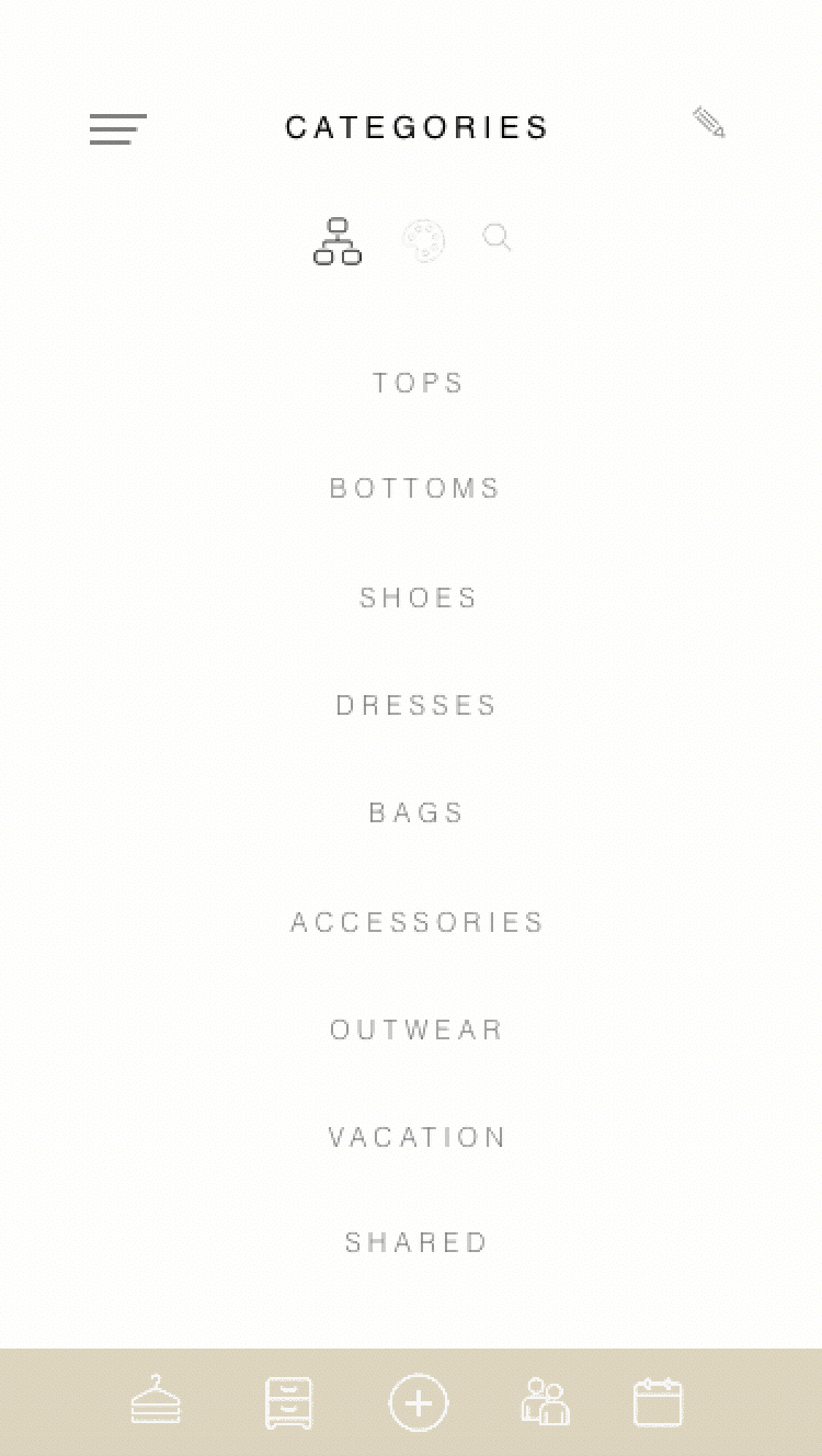
The main problem I noticed with the layout is how it doesn't read well with new users. I noticed in my research that a majority of participants would spend a few seconds skimming through the navigation and scroll immediately to the bottom. Most questioned what certain icons meant and how certain features worked - even though this was explained to them earlier.
With trial and error, they were able to maneuver through the app and eventually complete the task, but there was a lot of confusion. On average, it took people 3 to 5 minutes to complete a simple task.

Log in
When I downloaded the app, I was surprised to find it didn't have a login.
As I downloaded my outfits for vacation, it never occured to me that not having a login could be a problem until I had to replace my phone. All the data from the app disappeared, and what’s worse, nothing was backed up.
From this unfortunate event, I felt it would have been useful to have an account to log into. This way, no matter what happens your information is safe and always backed up.

Sharing feature
Another addition I felt could be useful would be a sharing option.
While I was helping my friend pack for her trip and looking through her closet, I realized I had a skirt that matched perfectly with one of her tops. That's when I thought of a new fun and engaging feature for the app - being able to collaborate and exchange items in our own closets!

Navigation and Layout
The Biggest concern that needed to be addressed was how the information was being displayed in the app.
I took the original icon placement from the top bar and readjusted them underneath the title. I also readjusted the menu from the bottom right to the top left. Rather then clicking on the icon, you can also swipe left-right to access it as well.
With the new additional feature; share, I also added a new icon in the bottom navigation bar as well as added a plus button in the center of the lower banner. These two new additions should decrease the time it takes to add clothes and increase the use of the new share feature.
First Iteration
In our first iteration, I optimized for scannability of the content by experimenting with different font weights, assigning icons to the bottom nav bar, as well as maintaining a consistent use of colors throughout each page of the app.

Design goals
-
Add visuals to build user trust and reduce cognitive overload
-
Bring content to the forefront and eliminate unnecessary steps
-
Increase engagement with the users; adding a Share option
-
Add security to the app with a profile/login addition
Visual treatment
Once I finalized the most important issues to address first I researched existing closet apps to get a sense of current design trends. I made sure that this redesign was created with the most recent iOS UI conventions in mind.

Outcome
After downloading the Your Closet app, it inspired me to dig deeper and enhance not only my own experience, but the experience of other users as well. I appreciate what this app has to offer and feel people could really benefit from closet organization. I believe my approach could provide solutions to these current problems.